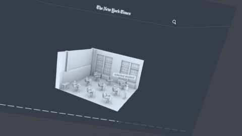
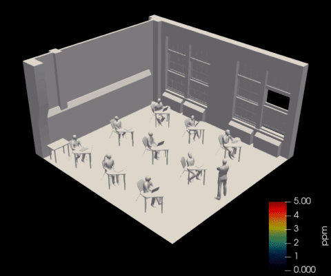
Airflow Visualization
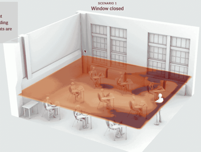
A collaboration between The New York Times newsroom graphics team and R&D. 3D visualizations of airflow in a New York city classroom demonstrating how simple steps like opening windows could decrease the chances of spreading illness and allow students to return to school safely. A front page print article, interactive web article, and augmented reality explainer published by The New York Times.
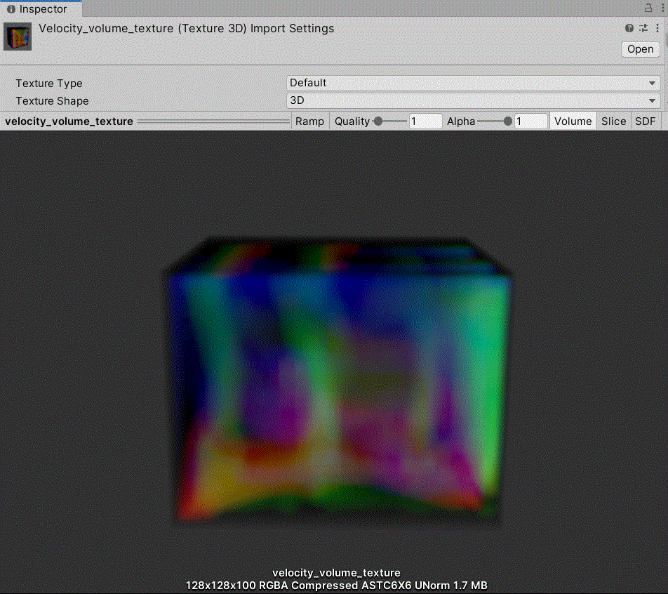
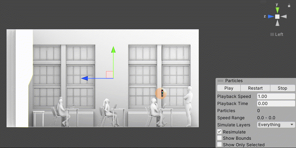
Working closely with a research team of engineers, scientists, editors, and journalists, I received raw airflow simulation data that I visualized using Paraview stream tracers, enabling the team to investigate the scenarios. During production, I wrote a Python automation system for Blender that prepared the dataset for the publication. I also wrote the graphics code for the web and AR explainer visuals. After we published, I worked with the data again to build prototypes in XR.
👤 Role: Software Engineer
🏆 Awards: The New York Times Publisher Award, Online Journalism Award Finalist, Peabody Nominee
Highlights

XR Prototype